Windows 10 is coming along nicely. A definite nice step from Windows 8.1 (once the bugs are out).
Still, not all is well yet.
The Windows 10 skin
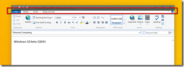
The Windows 10 skin has some issues. The title bar is thicker than some apps expect (such as Microsoft Live Writer). Stardock’s WindowBlinds has had to tackle this issue for years. I suspect WindowBlinds will be making a comeback with Windows 10 as the title bar and borders in windows 10 are a combination of not pretty and a bit hard to use at times (the border is one pixel making resizing a bit of a pain. Seriously.
The Start menu
 vs.
vs. 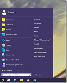
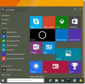
I’ve seen people argue that there is no need for a Start10. I think these two screenshots (the Windows 10 start menu on the left and the beta of Stardock’s Start10 on the right) make it pretty obvious that yes, a lot of people will want Start10.
Let’s walk through some of the issues:
- Where’s my home folder? Those items at the top left are hard-coded. You can’t remove them. Maybe they’ll fix that but time is starting to run short.
- It has no context menu whatosever for the menu. So it’s not easy to understand how/if you can change its behavior.
- If I want to pin my home folder, I have to pin it to the tiles part of it.
- I don’t even want to go into the spam abuse here. It already includes a bunch of junk I have on interest in, didn’t ask for. I can’t imagine what the OEMs will do. One can almost picture that that is the purpose of the tiles in there in the first place.
- You cannot pin short-cuts to the start menu.
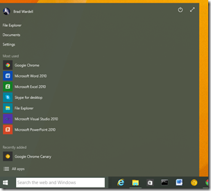
If I remove the junk I get this.
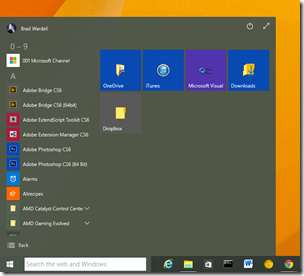
This is what you get if you choose “All Apps”.
Please, someone go ahead and make the argument that this is an improvement on the Windows 7 design? Tell me how it’s superior. In fact, if you can name 1 way it’s more usable than the Windows 7 design I’d really like to hear it. I’ll start with 1 freebie: it’s easier for touch UI. But if I’m using touch, I’ll be using the Start screen.
Home Group
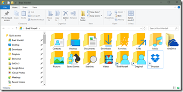
Speaking of the home group, these are the icons. I hope these are not what they plan to ship in the final. They’re very distracting.
Then there’s the ribbon. The giant “Pin to Quick Access” thing is very annoying. Luckily, I can minimize it but it seems like a step back. Another thing are all the little pins on the left. I get it, they’re pinned. I hope (assume) they will have an option not to show those. I couldn’t find any options in the folder options panel.
Did I mention how annoying it is that the borders are only 1 pixel?
It’s better than Windows 8
I prefer Windows 8.1 over Windows 7 with some caveats (Object Desktop installed). That’s because Windows 8 is so much better dealing with high DPI and it’s faster.
Windows 10 seems be be an improvement over Windows 8 in those terms as well. But the UX needs a lot of work still. On the other hand, if they don’t do that work, well, I guess I’ll be able to afford to send my kid to college after all. 

